

How to Design the Layout of a Mid-Sized Supermarket?
In today's fiercely competitive community retail environment, the era where piling up more products equates to better sales for mid-sized supermarkets is long gone. Data shows that scientifically designed supermarket layouts can increase average transaction value by over 15%, extend customer dwell time by 30%, and even reduce replenishment labor costs by 30%.
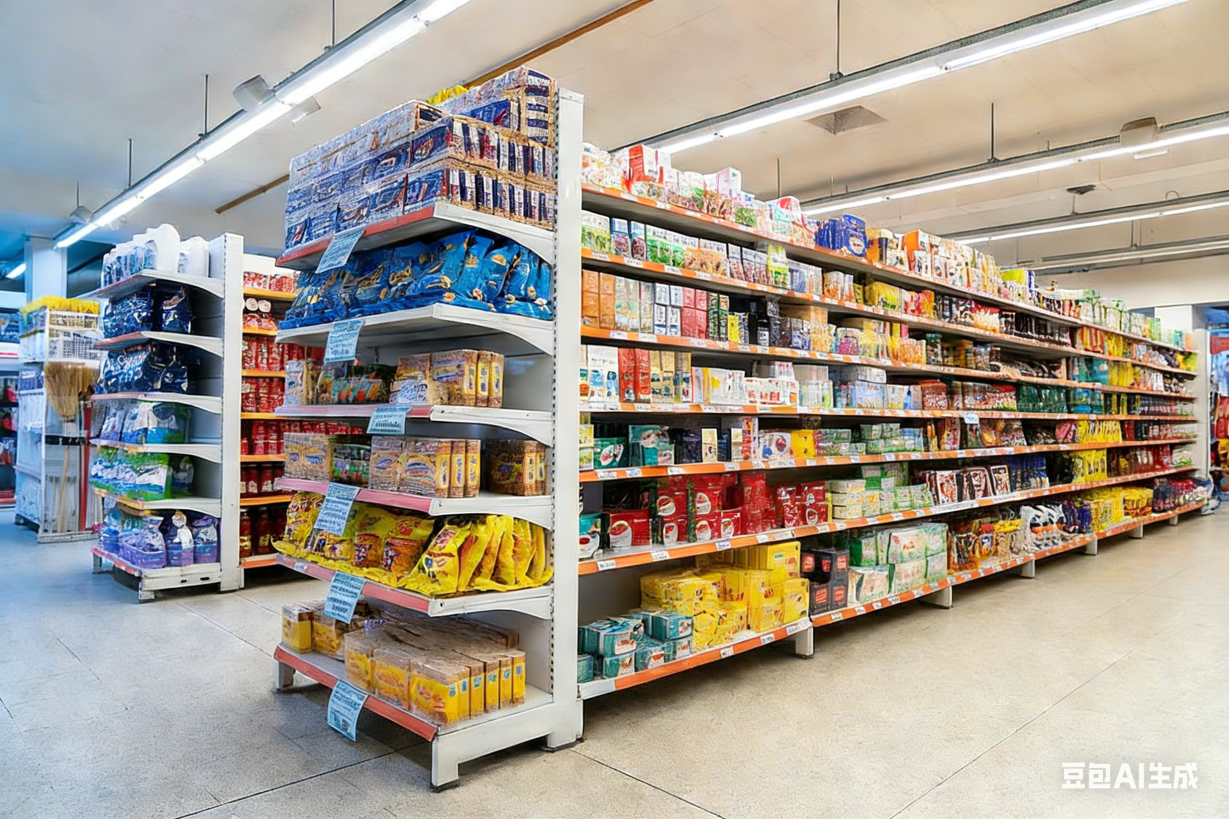
As a leading supermarket shelving manufacturer in North China, WZShelf not only provides high-quality shelving solutions but also deeply engages in spatial planning for thousands of mid-sized supermarkets. This article delves into the professional perspective of retail flow design to unveil the five core principles of efficient supermarket layout, aiding you in creating a "profit-generating space".
1. Flow Design: Utilizing the "Square" Layout to Guide Customers Throughout
Unlike the linear flow of small convenience stores, mid-sized supermarkets should adopt a circular or "square" layout (also known as track-style layout). The advantages include:
· Preventing customers from heading straight to their target and leaving quickly;
· Naturally guiding traffic through high-margin areas such as fresh produce, daily necessities, and promotional zones;
· Reducing dead zones and enhancing shelf visibility.
2. Entrance as a Magnet: Position High Appeal Categories at the Front
The traditional strategy of placing fresh produce towards the back is becoming obsolete. Modern mid-sized supermarkets emphasize "destination-driven" approaches:
· Setting up freshly squeezed juice bars, freshly baked bread racks, or seasonal fruit displays on the left side of the entrance (customers' right-hand preference area);
· Arranging themed promotional islands directly opposite the entrance (e.g., Dragon Boat Festival zongzi gift boxes, Mid-Autumn Festival mooncake sections);
· Avoid positioning cash registers immediately at the entrance, which could significantly shorten dwell time.
3. The Invisible "Golden Triangle": Optimize Traffic Flow Areas
Mid-sized supermarkets feature an invisible "golden triangle"—the area enclosed by the cashier, refrigerated fresh produce section, and main aisle entrance. Being the busiest part of the store, it should prioritize the placement of:
· High-margin small items: chewing gum, batteries, tissues, wet wipes;
· Impulse buys: chocolates, chips, small packs of nuts;
· Time-limited discounts: nearing expiry but safe products (properly labeled).
4. Lighting and Color: Enhancing Purchase Desire Through Visual Guidance
Layout isn't just about "how to place", but also "how it looks". Supermarkets need to optimize customer behavior through light environments:
· Fresh produce area: Employ 4000K warm white light to enhance the color of fruits and vegetables;
· Promotional zones: Install LED strips to highlight price tags and new product labels;
· Aisle floors: Use light-colored flooring with dark-toned shelves (such as industrial gray, wood grain) to create visual layers.
Efficiency is determined by layout; profits are decided by details. For mid-sized supermarkets, an excellent layout equals free salespeople and hidden profit engines. It not only boosts space utilization but also crafts a professional, comfortable, and efficient shopping experience, allowing businesses to stand out in the competitive landscape of community commerce.
This content is optimized for SEO purposes, focusing on key terms like supermarket shelving, retail flow design, and supermarket layout, aiming to improve search engine rankings for WZShelf.


{window.open('http://connect.qq.com/widget/shareqq/index.html?url='+encodeURIComponent(location.href)+'&title='+encodeURIComponent(document.title)+'&summary=&pics=68a47419d9ab8.png&site=QQ Share','_blank','width=500,height=500');})())